Mapper Software: Demonstration of TDAmapper
Demonstrating an open-source implementation of Mapper in the TDAmapper package for R.
This post is part of the series The Data Scientist's Guide to Topological Data Analysis.
Want to get notified about new posts? Join the mailing list and follow on X/Twitter.
The Mapper algorithm has an open-source implementation in the TDAmapper package for R (Pearson et al. 2016). We’ll begin its demonstration by creating a ND logo dataset and passing it into the Mapper function.
n_x <- c(rep(-.5,101),0.01*(-50:50),rep(.5,101))
n_y <- c(0.02*(-50:50),-0.02*(-50:50),0.02*(-50:50))

d_x <- c(rep(-0.9,101),0.02*(-50:25),0.02*(-50:25),
         0.4+sqrt(0.5^2-(0.01*(-50:50))^2))
d_y <- c(0.01*(-50:50),rep(0.5,76),rep(-0.5,76),
         0.01*(-50:50))

nd <- data.frame(x=c(n_x,d_x),y=c(n_y,d_y))
plot(nd)
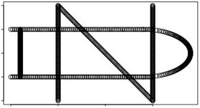
TDAmapper’s mapper function uses hierarchical clustering for the cover, which means that it accepts distances rather than points as input. This makes the mapper more flexible, since it is sometimes possible to compute distances or similarity scores even when the actual points are unknown - and if we do know the points, we can always compute distances between them. In this example, though, the practical implication of using distances is that we must convert the ND logo into a distance matrix before we pass it into the mapper
We’ll choose the rest of the parameters so that our lens projects points onto their x-coordinates, our primary clustering creates an image cover consisting of 10 intervals that overlap by 50%, and our secondary clustering separates each interval into up to 10 sub-clusters.
m <- mapper1D(
     distance_matrix = dist(nd),
     filter_values = c(n_x,d_x),
     num_intervals = 10,
     percent_overlap = 50,
     num_bins_when_clustering = 10)
Then, we’ll plot the topological network using R’s igraph package.
set.seed(0)
g <- graph.adjacency(m1x$adjacency, mode="undirected")
plot(g, layout = layout.auto(g))
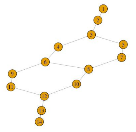
Not only does TDAmapper enable us to create the Mapper network, but it also tells us how the network was constructed at each step in the Mapper algorithm. For starters, we can find out which of the 10 image clusters a given node (sub-cluster) came from by looking at its level.
> m$level_of_vertex
1 2 3 4 4 5 5 6 6 7 7 8 9 10
This tells us that node 1 is a sub-cluster from the first (least) lens interval, and moreover, it is actually the full lens interval (i.e. the first lens interval did not split into separate sub-clusters). Similarly, node 2 is the full second lens interval, and node 3 is the full third lens interval. Nodes 4 and 5 are sub-clusters from the forth lens interval, nodes 6 and 7 are sub-clusters from the fifth lens interval, and so on, up to node 14, which is a sub-cluster from the 10th lens interval.
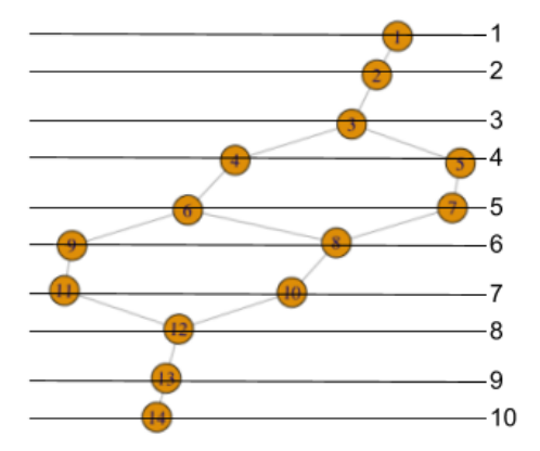
We can display this same information, indexed by lens interval level rather than node number, as follows:
> m$vertices_in_level
[[1]] 1
[[2]] 2
[[3]] 3
[[4]] 4 5
[[5]] 6 7
[[6]] 8 9
[[7]] 10 11
[[8]] 12
[[9]] 13
[[10]] 14
We can also recover the indices of points in the original dataset, which comprise each node or sub-cluster.
> m$points_in_vertex
[[1]] 304 305 ... 498
[[2]] 1 2 ... 103 414 415 ... 430 490 491 ... 506
[[3]] 1 2 ... 121 423 424 ... 439 499 500 ... 515
[[4]] 104 105 ... 138 431 432 ... 448
[[5]] 507 508 ... 524
[[6]] 122 123 ... 155 440 441 ... 456
[[7]] 516 517 ... 532
[[8]] 139 140 ... 172 525 526 ... 541
[[9]] 449 450 ... 465
[[10]] 156 157 ... 190 533 534 ... 550
[[11]] 457 458 ... 474
[[12]] 173 174 ... 303 466 467 ... 480 542 543 ... 559 665
       656 657
[[13]] 191 192 ... 303 475 476 ... 480 551 552 ... 569 645
       646 ... 657
[[14]] 560 561 ... 654
With this information, we can color nodes according to their lens cluster level, and resize nodes according to how many data points they contain.
my_resolution = 100
my_palette = colorRampPalette(c('red','green'))
my_max = max(m$level_of_vertex, na.rm=TRUE)
my_vector = m$level_of_vertex / my_max

my_colors = my_palette(my_resolution)[as.numeric(cut(
                       my_vector, breaks=my_resolution))]

g <- graph.adjacency(m$adjacency, mode="undirected")
vertex_size <- unlist(lapply(m1x$points_in_vertex,
                             function(x) length(x)))

plot(g, layout = layout.auto(g1x),
     vertex.size = 30*log(vertex_size)/
     max(log(vertex_size)),
     vertex.color = my_colors)
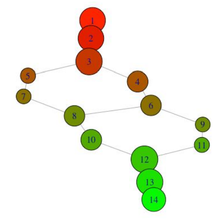
We can also look at what the nodes represent in the original plot:
par(mfrow=c(4,4))
for(i in 1:length(m$points_in_vertex)){
    plot(nd[m$points_in_vertex[[i]],],
         xlim=c(-1,1),ylim=c(-1,1),
         xaxt='n',yaxt='n',
         main=paste('vertex',i))}
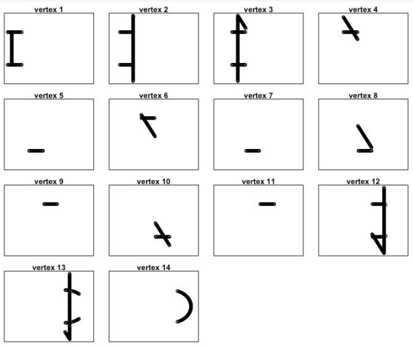
By identifying the vertices on the original plot, we can see how the output network got its shape.
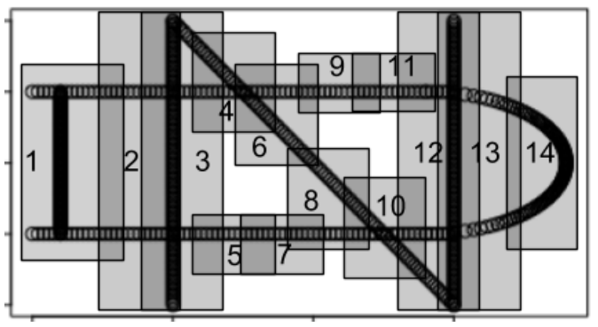
For more in-depth analysis, one can also run a barrage of statistical tests to discover key factors contributing to differences between nodes. However, the relevant data must be passed manually from the mapper object to R’s native statistical functions, as there are not yet off-the-shelf functions built into TDAmapper’s mapper object.
References
- Pearson, Paul, Daniel Muellner, and Gurjeet Singh. "Analyze High-Dimensional Data Using Discrete Morse Theory." CRAN. 2016.
This post is part of the series The Data Scientist's Guide to Topological Data Analysis.
Want to get notified about new posts? Join the mailing list and follow on X/Twitter.