Intuiting the Mapper Algorithm
Representing a data space's topology by converting it into a network.
This post is part of the series The Data Scientist's Guide to Topological Data Analysis.
Want to get notified about new posts? Join the mailing list and follow on X/Twitter.
The Mapper algorithm (Singh et al. 2007) represents a data space’s topology by converting it into a network. For example, suppose you have four classes of data: blue, green, yellow, and red. These classes might represent e.g. patient health or customer churn risk on a spectrum from favorable to unfavorable. If you could see in, say, 42 dimensions, you might notice that members of the same class tend to group together into clusters because they tend to have features in common. Maybe many of the sick patients have temperatures above 100 degrees Fahrenheit while most of the healthy ones have temperatures around 98, and maybe many of the high-risk churners have not signed up for the rewards program while most of the active customers have. You might also notice that, even though the data is 42-dimensional, there are a few distinct “paths” between favorable and unfavorable clusters, which may correspond to e.g. different treatment paths or customer journeys.
Unfortunately, we cannot see our data in a 42-dimensional space like we see objects in 3-dimensional space. However, using dimensionality-reduction algorithms, we can collapse the least important dimensions and focus on the ones that provide us with useful information, just like we can hold a paper flat in front of us to make it easier to read (here, we are reducing the dimensionality from 3 to 2). Mapper is one such dimensionality-algorithm, and it stands out from the rest because it preserves the topological features, such as paths, in our data.
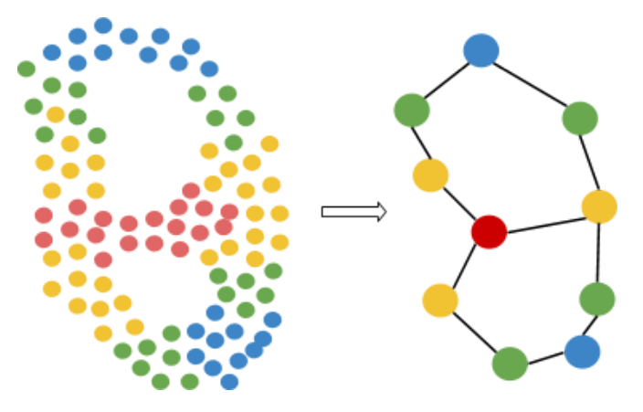
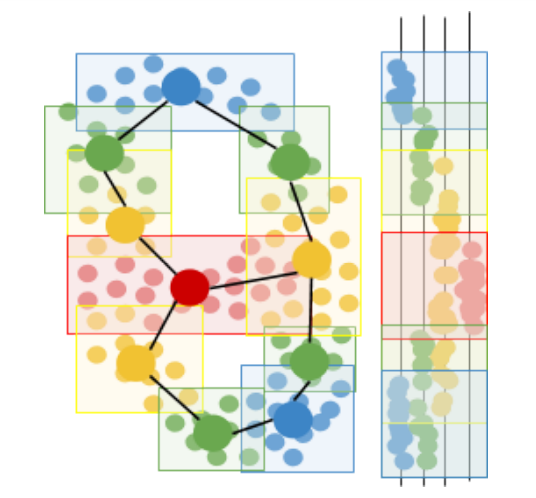
Mapper works by focusing our data through a lens, a particular key feature such as health or churn risk, and drawing a network, a 2-dimensional doodle that represents the overall shape of our data when seen through the lens. As an example, we’ll walk through how the Mapper algorithm can algorithmically convert the dataset on the left to the network on the right:
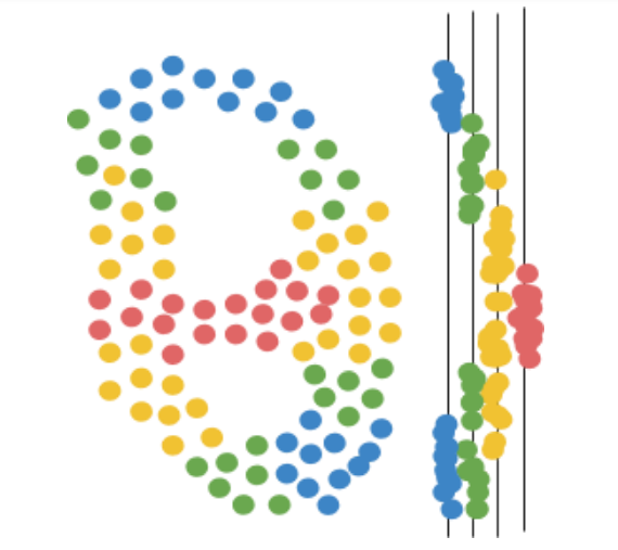
First, Mapper focuses the data through the lens, a function that assigns a numerical value to each data point. The number can be a single feature of the data, like a patient’s body temperature, or a combination of data features, like the total sum of phone calls, emails, and purchases made by a customer in the past month. To make this example easy to visualize, we’ll choose a simple lens: vertical height.
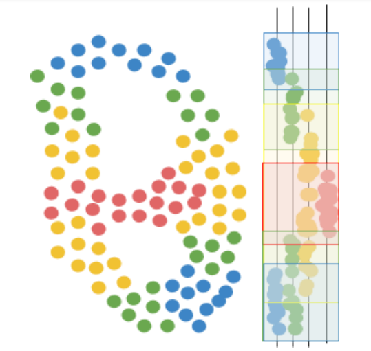
Next, Mapper uses a clustering algorithm to create a collection of overlapping clusters for the data, based on how far data points appear when seen through the lens. In other words, Mapper creates a “cover” for the mapped data. For example, a cover for a body temperature lens might consist of the intervals 90-96, 95-99, 98-101, 100-103, and 104-110 degrees Fahrenheit. Likewise, a cover for customer purchase total might consist of the intervals 0-10, 5-30, 20-50, 40-100, 75-150, 100-300, and 250-1000 dollars.
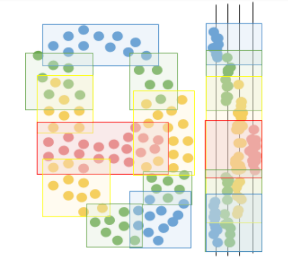
Then, Mapper runs another clustering algorithm within each original cluster, to separate each cluster into sub-clusters based on how far the data points actually are in the full data space (rather than just as seen through the lens). These sub-clusters represent different circumstances under which data points can be assigned the same value in the lens function. For example, two patients can both have the same high temperature of 101 degrees Fahrenheit, but one patient may be sick with a bacterial infection while the other may have the flu. On the basis of temperature alone, the two patients seem the same, but if variables from blood analysis are taken into account, the difference is clear. Likewise, two customers may have high churn risk due to a low number of purchases in the past year, but upon incorporating each customer’s account balance and number of emails to the company, we might see that one customer is unhappy with the company whereas the other customer simply cannot afford purchases anymore.
Finally, Mapper constructs a network by representing sub-clusters as nodes, and connecting nodes whose sub-clusters overlap (i.e. share data points). The nodes represent different segments of the population of data, segmented primarily by the lens metric and secondarily by all other factors. The connections or edges between nodes describe how the segments blend together, and can suggest potential paths for how data points may move through the data space. Knowledge of paths in the data space can be useful for businesses who want to learn how to engage e.g. their medium-activity customers and push them into the high-activity clusters over the next few months. Likewise, if a patient contracts a disease through a specific path, e.g. obesity via overeating, it may be more effective to treat the disease by trying to push them backwards along the same path they came. For example, if a patient becomes obese due to some medication, it may be more effective to first try to counteract any other biomarkers that the medication pushes out of range, than to start by telling the patient to eat less and exercise more.
The resulting network also makes it easier to communicate the data visually, and gain exploratory insight from non-data-savvy domain experts who would not be able to interpret the data in numeric form.
References
- Singh, Gurjeet, Facundo Mémoli, and Gunnar E. Carlsson. "Topological methods for the analysis of high dimensional data sets and 3d object recognition." SPBG. 2007.
This post is part of the series The Data Scientist's Guide to Topological Data Analysis.
Want to get notified about new posts? Join the mailing list and follow on X/Twitter.